Logo
The gradient background of the logo can be changed to match the design it's used on. Be sure to keep a strong contrast between the gradient colors and the white logo text.
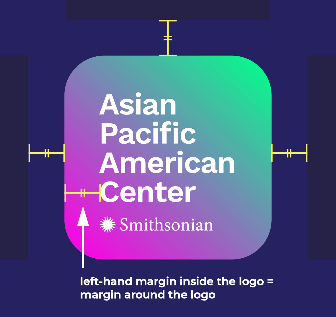
Logo Guidelines
Do not alter the logo text or the “Smithsonian” portion of the logo.
Minimum Width: Digital: 195 px • Print: 2.75”
Margins: 1/6 the width of the logo (or the margin between the text and the left side of the logo)
SI Legacy Logos
The Smithsonian also provides these logos, which may be more appropriate for certain usages or sizings/dimensions
For guidelines on these logo, see pages 41-44 & 55-56 of the SI brand guide.


Fonts
Our main font is Montserrat. The thinnest font weight that we commonly use is Montserrat Light. The heaviest font weight is Montserrat ExtraBold.
Other commonly-used fonts include Raleway, Open Sans, and Roboto
More stylized fonts may be used for specific events, webpages, initiatives, etc.
When using different weights of the same (or similar) font(s), keep a strong contrast between the two weights. This example compares a Montserrat Medium & SemiBold pairing with a Montserrat Light & Semibold pairing.

Colors
Our color palette is flexible and varies by project. We usually use palettes that revolve around 2-3 bold, heavily saturated hues. Below are a few “starter colors” that are consistent with many designs made in the past. Don’t feel restrained to these specific colors: consistency with the overall aesthetic of APAC is more important than replicating what we’ve done in the past.
Accessibility note: this site is useful for checking the contrast between colors.

#FFCD4F
#FFEA4F
#D33D29
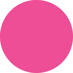
#ED4E96
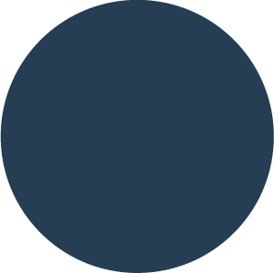
#253E53
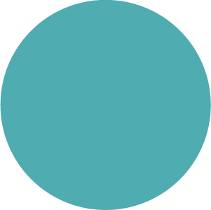
#4FACB1
Overall Style & Samples
Our design style is flexible and project-dependent. Much of our process is intuitive and revolves around creating something unique for each project without drifting too far from the overall APAC feel.
There are a handful of common threads that run through many of our designs—use them more as a starting point instead of hard and fast rules. Have fun with it!
Common characteristics:
• Limited color palette revolving around a few bold, heavily saturated hues
• Simple geometric shapes and outlines
• Use of angles, diagonal lines, or other elements that create a sense of movement in the design
• Lush floral or natural elements
• Heavily layered shapes, text, photos or collage-type elements
• Incorporation of artwork from the featured artists (don’t feel obligated to include this, but sometimes the best branding is the art itself)
Below are examples of these characteristics in past designs:
[smartslider3 slider="2"]


